Your brand’s colors have more impact on the customer’s psyche and buying decisions than you think! It is a reflection of what your business stands for and has a crucial role in aiding brand recall, even when your brand’s name is missing.
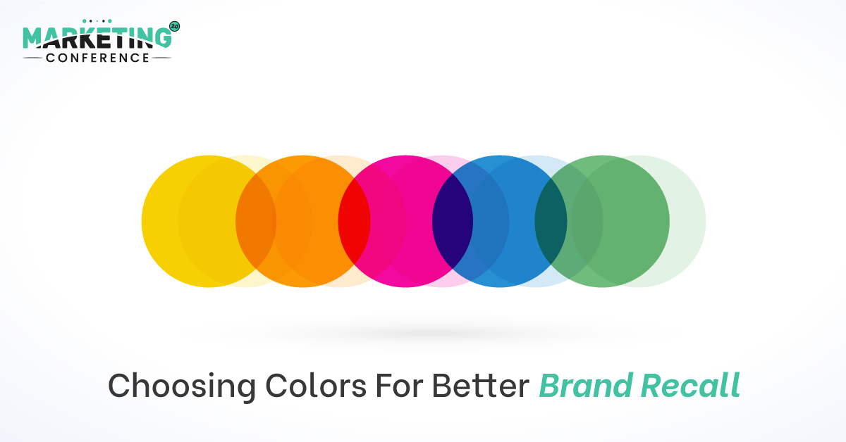
Let’s give you a few examples to prove how vital colors are for brand recognition. Just picture a few brands and try to remember the color of their logos. Twitter? That’s right; the color that comes to mind is blue. Netflix? Red and a black background. Coca-Cola? Red again. This shows how the human brain is quickly able to associate brands with their colors.
Numerous post COVID marketing conferences in the USA have proven—with case studies—that one of the most crucial ingredients needed for good branding is choosing the right brand color. In this blog, we will share a few tips on how to go about it:
Before working on your marketing visuals, including fonts, color palettes, and logos, spend some time thinking about your brand’s mission, story, target audience, the niche it is in, and the solutions it provides. These will provide you with the fundamental groundwork you will need for brand building.
For instance, colors are believed to elicit specific emotions and feelings in humans. If you know your brand’s story and what you want your customers to feel when they see your products, you can subsequently study the basics of color psychology and choose a palette accordingly.
To begin, we recommend that you use 5-10 adjectives to describe your brand and the emotions you’d like to associate it with. You will need it for the next step.
Color theory describes how individuals perceive and decode color and the cultural associations that come with it. It is an extensive area of study, so we will give you a quick overview.
Take the color red, as an example. It is associated with love, lust, excitement, and passion. Or yellow, which represents playfulness, optimism, and happiness. Green demonstrates wealth and often, sustainability and wellness too. Blue has a calming effect and also signifies cleanliness and responsibility.
Here, it is important to note that the meanings of color may change depending on cultural contexts and the other colors it has been paired with. A few colors, in particular, are used by businesses in specific industries as they align with their goals and mission. For instance, many health companies opt for blue as it is associated with trustworthiness. So, do keep these pointers in mind while choosing a color for your brand.
Don’t just stick to tried-and-tested palettes. To set your brand apart, you just need the above-mentioned basics as your foundation and then, you can express your brand’s unique identity by letting your creative juices flow! Top leaders at marketing summits have suggested that you should look for inspiration around you. Do study your competitors’ works and examine the visuals of major businesses. Research the reasons why their brand colors have a significant impact on their target audience. This will help you to get an idea of what really works in the market.
To get a clearer picture of such branding strategies, fly down to Marketing 2.0 Conference’s Las Vegas and Dubai editions in 2022!